60-30-10 Color Rule 2026: New Proportions for High-Contrast Spaces
Anúncios
The 60-30-10 color rule has long been used as a simple framework for balancing dominant, secondary, and accent colors in interior design.
In 2026, designers are experimenting with new proportions to create more expressive and high-contrast living spaces.
These updated ratios offer greater flexibility for people who want stronger contrasts, more personality, and less predictable approaches to home decor.
The Shifting Landscape of Interior Color Theory
The traditional 60-30-10 color rule is being reconsidered as homeowners increasingly look for interiors with greater contrast and more individual character.
Designers are experimenting with different color distributions that allow secondary and accent shades to occupy a larger visual role within a room.
Anúncios
This shift does not necessarily eliminate the original rule but expands the number of frameworks available for building balanced and expressive color schemes.
Deconstructing the Traditional 60-30-10 Rule
The classic 60-30-10 color rule divides a room into 60% dominant color, 30% secondary color, and 10% accent color.
This structure creates a clear hierarchy, helping the eye understand which shade establishes the room and which colors provide support and emphasis.
While effective, the formula can produce predictable results when applied too rigidly, which is why newer proportions are becoming attractive for bolder interiors.
Understanding the Original Proportions
The 60% dominant color generally appears across the largest surfaces, such as walls, floors, cabinetry, or other visually substantial elements.
The 30% secondary color can appear in furniture, curtains, rugs, or larger decorative features that provide contrast without competing with the main shade.
The remaining 10% is traditionally reserved for artwork, cushions, accessories, and other smaller details intended to create focal points.
Anúncios
Emergence of New Proportions in 2026
New interpretations of the 60-30-10 color rule are giving homeowners additional ways to control contrast and visual emphasis within a room.
The ratios 70-20-10, 50-30-20, 40-30-30, and 60-20-20 shift the relative importance of dominant, secondary, and accent colors.
Each framework creates a different level of intensity, allowing the proportions to be selected according to room size, lighting, furniture, and personal preference.
The 70-20-10 Proportion: Emphasizing Dominance
The 70-20-10 proportion increases the dominant shade to 70%, creating an immersive environment built strongly around one primary color.
The secondary shade occupies only 20%, while the final 10% provides a more concentrated accent that can create a clear focal point.
This ratio can work well in minimalist or monochromatic rooms where the objective is to emphasize depth within a tightly controlled palette.
The 50-30-20 Split: Enhanced Secondary Impact
The 50-30-20 ratio reduces the dominant color and gives the accent shade a larger 20% share of the overall visual composition.
This creates more opportunities to introduce bold furniture, textiles, artwork, or architectural details without overwhelming the entire room.
The proportion can make a scheme feel more energetic because two supporting colors occupy a larger part of the space than under the classic formula.
High-Contrast Living Spaces: The Driving Force
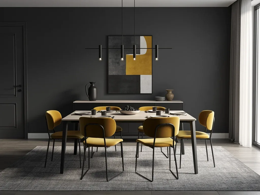
Interest in high-contrast interiors is one reason the 60-30-10 color rule is being adapted rather than followed as a fixed formula.
Stronger differences between dark and light shades, saturated and muted colors, or warm and cool tones can make architectural features more visible.
High contrast also creates immediate visual impact, which appeals to homeowners looking for interiors that feel distinctive rather than neutral or understated.
The 40-30-30 Balance: Bold and Equal Accents
The 40-30-30 ratio reduces the dominant color considerably and gives the other two shades nearly equal visual importance.
This creates a more layered and energetic composition where multiple colors can compete for attention without one shade completely controlling the room.
The approach is especially suited to eclectic or maximalist interiors where bold combinations and visual complexity are part of the intended aesthetic.
The 60-20-20 Variation: Stronger Accents, Defined Secondary
The 60-20-20 variation keeps the stability of the original 60% dominant shade but divides the remaining space equally between two supporting colors.
This makes both secondary and accent colors more noticeable while preserving a clear visual anchor throughout the room.
It can be a practical choice for people who like the structure of the original 60-30-10 color rule but want stronger contrast.
Practical Application of New Proportions
Applying these newer proportions requires more than simply calculating percentages because color intensity and placement also affect how a room feels.
A dark shade covering 20% of a room may appear more dominant than a pale color covering a larger area, so visual weight should always be considered.
Lighting, room dimensions, flooring, furniture, and existing architectural features should all influence how each percentage is translated into the final design.
Selecting Your Dominant, Secondary, and Accent Colors
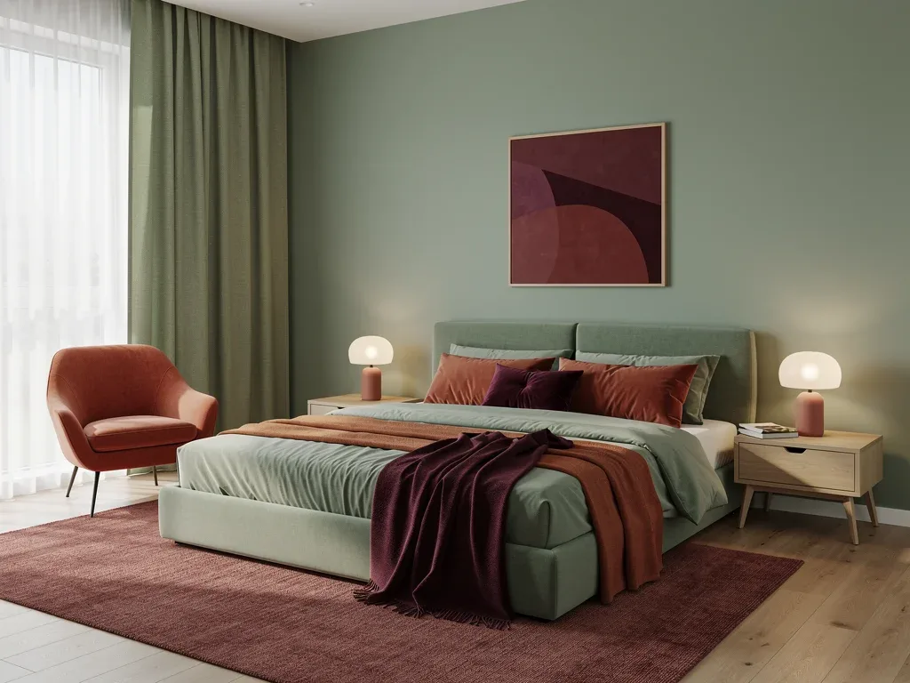
Start with a dominant shade that supports the mood you want to establish because it will occupy the largest visual portion of the room.
The secondary color should either complement the base or create deliberate contrast while still working across furniture, textiles, or other significant elements.
The accent shade can then introduce stronger personality through decorative objects, artwork, lighting, or smaller pieces with more saturated color.
Consider the emotional impact of each color within the room.
Test combinations under both natural and artificial lighting.
Use texture and pattern to add variation within the selected proportions.
The Role of Texture and Materials in Color Schemes
Texture can change how color is perceived and can make high-contrast living spaces feel richer and more layered.
Wood, metal, stone, glass, velvet, boucle, and other materials reflect or absorb light differently, creating variations even within the same color family.
Combining color with material contrast is therefore an important part of modern interior design and can make new proportions feel more intentional.
Integrating Patterns and Prints
Patterns can introduce several colors at once, making them useful for distributing secondary and accent shades without relying entirely on solid surfaces.
A rug, wallpaper, curtain, or upholstered chair can repeat the room's main colors while creating rhythm and visual movement.
The scale of the pattern should correspond with the size of the room and surrounding furniture so it supports rather than overwhelms the scheme.
Use patterns to introduce secondary colors across larger surfaces.
Add smaller prints through cushions and decorative objects.
Balance pattern scale with room dimensions and furniture size.
Future Outlook: Beyond 2026 Color Trends
The evolution of the 60-30-10 color rule reflects a broader movement toward more flexible and personalized approaches to interior design.
Rather than following a single formula, designers are increasingly treating color proportions as adaptable frameworks that respond to individual spaces and preferences.
Future trends are likely to continue experimenting with contrast, texture, materials, and unconventional color distribution rather than returning to one universal ratio.
Key Aspect | Description |
|---|---|
Rule Evolution | The 60-30-10 color rule is being adapted for more expressive and high-contrast interiors. |
New Proportions | 70-20-10, 50-30-20, 40-30-30, and 60-20-20 offer alternative approaches. |
High-Contrast Focus | Greater visual distinction between colors creates stronger and more dramatic spaces. |
Design Flexibility | The new frameworks allow more personalized distribution of color throughout a room. |
Frequently Asked Questions About Evolving Color Rules
Why is the 60-30-10 color rule evolving in 2026?▼
Designers and homeowners are seeking more personalized and high-contrast interiors, encouraging greater flexibility in how dominant, secondary, and accent colors are distributed.
What are the four new proportions for high-contrast living spaces?▼
The four proportions discussed are 70-20-10, 50-30-20, 40-30-30, and 60-20-20, each creating a different balance between dominant and supporting colors.
How do these new proportions differ from the traditional 60-30-10 rule?▼
They increase or redistribute the visual presence of secondary and accent shades, making it possible to create stronger contrasts and more expressive rooms.
Can these new color proportions be applied to any room?▼
Yes, but the proportions should be adapted to room size, lighting, function, existing materials, and the intensity of the selected colors.
What role do texture and materials play in these evolving color schemes?▼
Texture and materials influence how light interacts with color, helping the same shade appear softer, deeper, brighter, or more visually complex depending on the surface.
Looking Ahead: The Future of Color in Design
The changing 60-30-10 color rule demonstrates that interior color theory is becoming more flexible rather than abandoning balance altogether.
Designers can use alternative ratios to create stronger contrasts while still maintaining cohesion through repeated materials, textures, and carefully selected hues.
As interior preferences continue to evolve, color proportions will likely function increasingly as creative guidelines rather than strict mathematical rules.